
On July 22, 2024, Earth experienced its hottest day ever recorded, a milestone in a series of unprecedented high temperatures reported by NASA.
This event is a stark indicator of the ongoing global warming trend, primarily driven by human activities such as the emission of greenhouse gases. NASA, leveraging its vast array of Earth-observing satellites, plays a crucial role in tracking these changes and aiding communities to adapt to escalating temperatures.
Record-Breaking Global Heatwaves
According to a NASA analysis of global daily temperature data, July 22, 2024, was the hottest day on record. July 21 and 23 of this year also exceeded the previous daily record, set in July 2023. These record-breaking temperatures are part of a long-term warming trend driven by human activities, primarily the emission of greenhouse gases. As part of its mission to expand our understanding of Earth, NASA collects critical long-term observations of our changing planet.
NASA’s Monitoring Efforts and Community Impact
“In a year that has been the hottest on record to date, these past two weeks have been particularly brutal,” said NASA Administrator Bill Nelson. “Through our over two dozen Earth-observing satellites and over 60 years of data, NASA is providing critical analyses of how our planet is changing and how local communities can prepare, adapt, and stay safe. We are proud to be part of the Biden-Harris Administration efforts to protect communities from extreme heat.”
This preliminary finding comes from data analyses from Modern-Era Retrospective analysis for Research and Applications, Version 2 (MERRA-2) and Goddard Earth Observing System Forward Processing (GEOS-FP) systems, which combine millions of global observations from instruments on land, sea, air, and satellites using atmospheric models. GEOS-FP provides rapid, near-real time weather data, while the MERRA-2 climate reanalysis takes longer but ensures the use of best quality observations. These models are run by the Global Modeling and Assimilation Office (GMAO) at NASA’s Goddard Space Flight Center in Greenbelt, Maryland.
Continuation of a Warming Trend
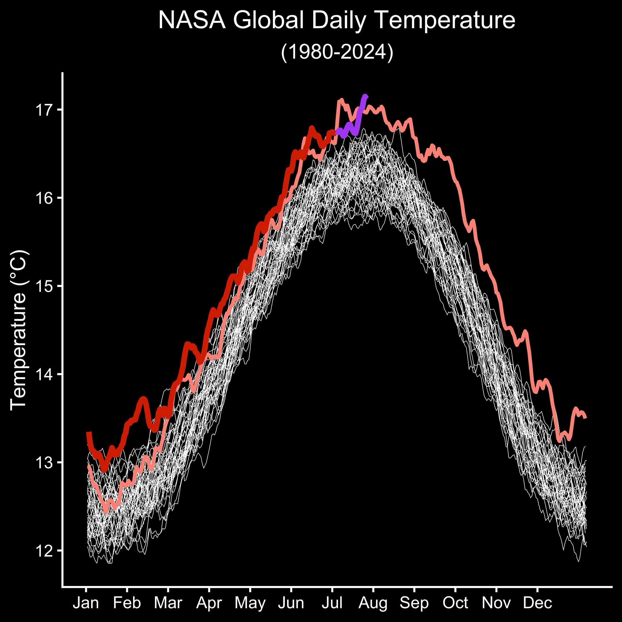
Daily global average temperature values from MERRA-2 for the years 1980-2022 are shown in white, values for the year 2023 are shown in pink, and values from 2024 through June are shown in red. Daily global temperature values from July 1 to 23, 2024, from GEOS-FP are shown in purple. The results agree with an independent analysis from the European Union’s Copernicus Earth Observation Programme. While the analyses have small differences, they show broad agreement in the change in temperature over time and hottest days.
The latest daily temperature records follow 13 months of consecutive monthly temperature records, according to scientists from NASA’s Goddard Institute for Space Studies in New York. Their analysis was based on the GISTEMP record, which uses surface instrumental data alone and provides a longer-term view of changes in global temperatures at monthly and annual resolutions going back to the late 19th century.
8 Comments
Once again, there are no error bars, AKA uncertainty range, provided so that the reader can determine if the difference is statistically significant.
It may actually be warmer as claimed, but then that has to viewed in the context that the Wisconsin stage glaciation reached its maximum expansion (minimum temperatures) between 20 and 25 thousand years ago, and has been warming erratically since then. Warming accelerated about 11,700 years ago, at the start of what is defined as the Holocene, the current interglacial.
“Scorching” is a little over the top!
Why are the temperatures from GEOS-FP (purple line) spliced onto the temperatures from a different source(s)? Is this a case of cherry picking from a basket of apples and oranges? Why not write a clean story that is above criticism?
“While the analyses have small differences, they show broad agreement in the change in temperature over time and hottest days.”
When one is worrying about hundredths of a degree, those “small differences” are important if one is concerned about consistency and accuracy. Comparing daily temperatures from one data set to another is highly suspicious. Why didn’t the analysts stick with the same data set?
One can excuse Chicken Little’s behavior because she didn’t know any better. However, the people at NASA are supposed to be educated, experienced experts. It would seem then that the only explanation for releasing easily criticized press releases is that they are being duplicitous in an attempt stampede the public into ‘willingly’ accepting a reduction in their quality of life resulting from changes recommended from the likes of those very same duplicitous ‘experts.’
The Earth’s global temperature is not the problem here – the problem is the way they’re recording it. The recording itself goes back as recent as a century and a half. That’s not very long. The coverage is STILL not 100% global (it’s at 84%, as per NASA), and it was even less so up until recently. And lastly, many traditional weather stains are contaminated by being swallowed by urban areas.
So how they dare to make such a drama out of this, with such a shoddy data pool is beyond me.
And, anecdotally, the current summer is nothing new to me. I remember scorching summers back in the 80s, too. People were complaining, bush fires were rampant, water systems were stretched out to a break point …. but absolutely no one thought of indulging into climate alarmism.
This can’t be a global temperature, maybe the Northern Hemisphere, at best, or possibly just the USA. July is the middle of winter in the southern hemisphere. The temperatures are at a local minimum in July in the southern hemisphere, analogous to January in the norther hemisphere. The global average that includes both hemispheres would be much flatter since they roughly balance each other out in temperature. It rises during the spring in the northern hemisphere and falls at the same time during fall in the southern hemisphere. In addition, it’s not the peak temperature at any one time that’s most significant, which can be due to normal fluctuations, it’s the average over the entire Earth for one year that carries the most significance for global warming. That value, calculated by much more reliable sources, is on the order of a degree or two increase in recent years.
You raise a good point. The graph at the top does seem to reflect the seasonal temperatures of the northern hemisphere. One explanation might be a sampling bias. There is less land in the southern hemisphere and the density of weather stations is also lower. Thus, when averaging, the average will be weighted more heavily by the northern hemisphere. However, their claim does warrant validation to show just what the graph is supposedly revealing.
Currently, WUWT is showing a global average temperature of 14.47 degrees Celsius, about 2.5 degrees cooler than the graph in this NASA press release. This further suggests that what the graph is showing is misrepresented.